Finance App Redesign
In this freelance job, I helped Toropal, a start-up company in the finance sector, redesigned its interfaces.
Problem
Toropal is preparing to entering the Kenya market as a money transfer app. However, there is a lack of branding on the current interfaces, and some features are not intuitive and user-friendly.
Client

Toropal
Toropal is a money transfer app that provides a fast, safe and easy way to send money to friends, family and loved ones. It mainly focucues on the African market.
Roles & Duration
-
Established project goals
-
Conducted heuristics evaluation
-
Created low and high-fidelity prototype
-
Conducted usability testing
-
Coordinated with software engineers
Jan 2023 - April 2023
Design process
Step 1: Evaluate the current app
I first evaluated the current Toropal app using heuristics evaluation. The following problems were found:
Violate: Match between system and the real world
1. Confusing Icon
The icon for the transactions menu item is a hamburger icon, which is far from people's perception of transactions and conveys misleading information. I suggested changing the icon to reflect its meaning.

Violate: Consistency and standards
2. Inconsistent Buttons
There are different forms of buttongs on the current interfaces, and some of them just look like plain text, with nothing to indicate that they are clickable. I suggested changing the look of the buttons to make them feel clickable and consistent.


3. Confusing switch
The switch between "wallet" and "bank" was placed underneath, which is against industry standards and may cause confusion for users. Besides, using "wallet" and "bank" alone were not clear enough. I suggested changing "wallet" to "mobile wallet", and "bank" to "bank account".

Violate: Visibility of System Status
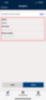
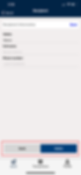
4. Input fields are hard to identify
As shown on the image, the input fields are not obvious to users, and there is no feedback given to users when they select a field to fill.

Violate: Aesthetic and minimalist design
5. User interfaces are not up to modern standards
The overal design of the app lacks character, and does not adopt modern design practices. I suggsted a total overhaul of the design of the app.
%20Screen%201.png)
Step 2: Establish a new design system
After discussing with the CEO of Toropal, I learned that he wanted a major rebranding of the product, so I started from building a new design system from scratch. I decided to continue to use blue as the main colour to show trust, but I changed the dark blue to light blue to appear to younger audiences. A curve was added to the header bar to differentiate the product from others. I selected Source Sans Pro as the font to use because it is modern and easy to read on mobile devices.

Step 3: Interface Design
After establishing the design system, I referred to the heuristics evaluation I did on the current app and the goals set by CEO to design interactive prototypes. The following before-after screen shows how the app was improved.
Before


Sign Up and Log in page
%20Screen%201.png)
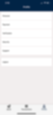
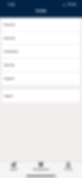
Profile Page
%20Screen%201.png)
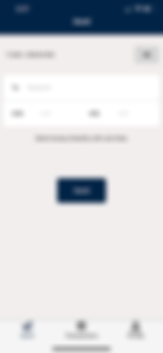
Send Money Page

Receipient Page
After


Sign Up and Log in page


Profile Page

Send Money Page


Receipient Page
Newly added pages


During the design process, I communicated frequently with programmers and manager to ensure that the solutions I provided were feasible and matched user needs. I also adapted my design according to feedbacks from team members. I established a design system before prototyping, and I found referring to the sytem helped me produce consistent design.