OneEleven Website Redesign
In our capstone project, we paired up with OneEleven, a leader in incubator/ accelerator services, to improve their web experiences.
Problem
The website of OneEleven does not effectively communicate its distinctive values and membership criteria to potential clients. In addition, the application process on OneEleven's website is needlessly complicated. Our goal is to redesign the website to highlight the information that is most relevant to our target audience and simplify the website's application page. This will enable potential clients to quickly understand what OneEleven offers, determine whether they would like to become a member, and easily complete the application process.
Our Client

OneEleven
OneEleven is an incubator/accelerator service located in Downtown Toronto. It provides office space, programs, support, and networking opportunities for founders and their employees. They are looking forward to expanding their online presence.
Roles & Duration
-
Conducted user research
-
Established project goals
-
Created low and medium-fidelity prototype
-
Conducted usability testing
Jan 2023 - April 2023
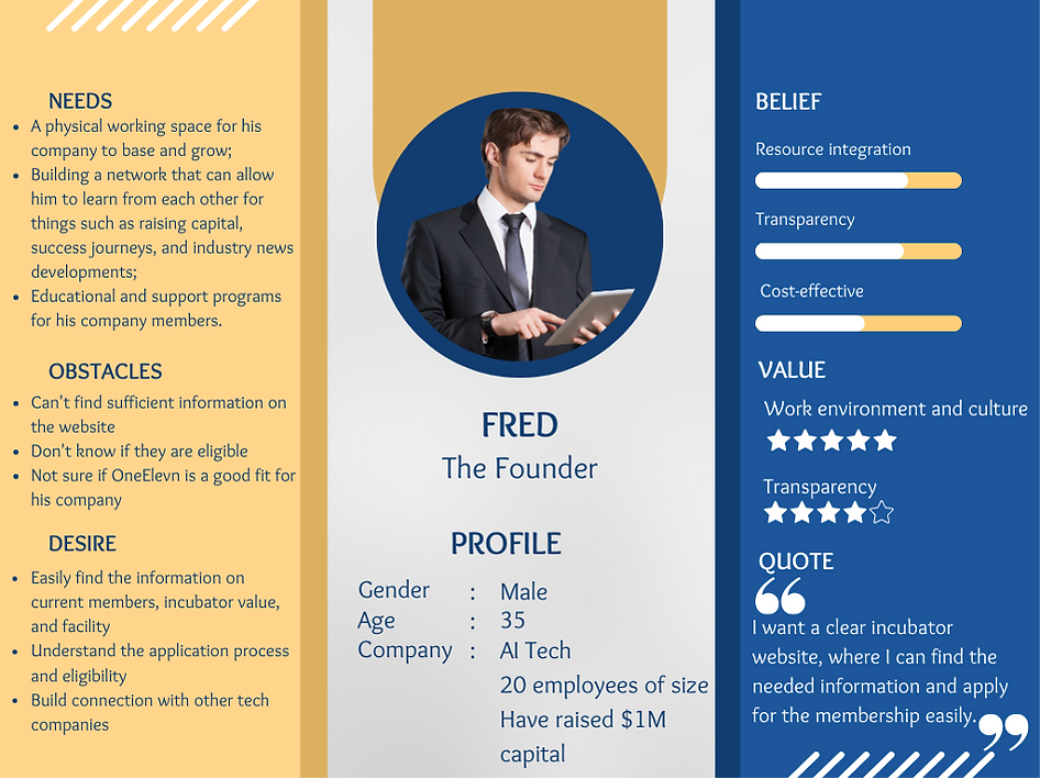
Introducing our Persona: Fred the founder

Highlight 1
Interactive Facility Map
The map shows key facilities and their locations to potential clients to help them visualize the office space.
-
Hover and click to view more details
-
Gallery of real pictures
-
Colour-coded


Highlights
Highlight 2
Better Organized home page
The previous homepage has small fonts and shows little important information for potential customers. Our newly designed homepage features key business stats and a clearer page layout which helps users navigate the site effortlessly.
-
Directly answer "What is OneEleven?"
-
Includes a shortcut for applying for membership
-
Fewer texts, less burden


Highlight 3
Various filters in the members page

The old member page contains numerous members. However, there is no search function and no filters, making it hard for users to locate a specific company which matches their interests. Our new design is the solution.
-
Search feature
-
Filters for membership status, industry, company size and stage
Design process
Step 1: Define Project Scope
At this stage, we met with the representative of OneEleven, Julia, and talked about the scope of the project.
The goal is to deliver high-fidelity prototypes of the redesigned OneEleven website.
-
Objective 1: Clearly deliver the company value proposition
-
Objective 2: Increase the number of eligible membership applications
-
Objective 3: Coming out with a clear and easy-to-understand information architecture
After clearly defining the goals of the project with the client, we are able to focus our research and design on those issues that matter the most.
Step 2: Conduct secondary and primary research
Research Methods
Secondary Research
Literature Review
.png)
Competitor Analysis

Heuristic Evaluation

Primary Research

5 Interviews and think-aloud exercises with end users
Key Findings
Secondary Research
-
The purpose of the website is not clear. For instance, on the homepage, there is a catchphrase "built to scale". However, from this phase, we are still unsure about what this company does.
-
Lack of search and filter feature
-
The colour contrast and text size are small
-
The language on the website does not speak to the users
Primary Research
-
Lots of information that the users care about is missing from the website (i.e.: what program it offers, how much funding they could grant)
-
Some website labels do not accurately indicate the content, causing confusion
-
The application page is long and confusing. The users are unsure about whether they are eligible to apply.
-
Users care about the connections they can make with other companies at OneEleven and the size of the office space
-
Most of the funders knew OneEleven from personal connections, and their web presence is weak
After collecting research data, we planned to analyze data to identify trends next.
Step 3: User Research Analysis
-
Analyzed data with an affinity diagram
2. Created persona Fred
3. Created an experience map

4. Identified pain points
Pain Point 1
Fred doesn't know how the current members perform and what sectors they are in
Pain point 2
Fred does not understand the application process and the eligibility requiremnts
Pain point 3
Fred needs connections with other tech companies
After analyzing research data, we were able to identify pain points. However, we still need to envision creative solutions and designate priority levels.
Step 4: Requirement Analysis
1. Generate Big ideas

2. Prioritization Grid
We decided to only focus on the home runs, quick wins and big bets for our final product.

After setting design requirements, we are ready to move to the design phase to visualize our ideas.
Step 5: Prototypes
1. Goal of the redesign
Redesign the website to highlight the information that is most relevant to our target audience and simplify the website's application page
2. Low and medium-fidelity prototype
Home page


Members Page

.png)
About page


Events page


Application Page


After designing low and medium-fidelity prototypes, we need to further refine it. In the next stage, we invited users to test our products so our design was evidence-based.
Step 6: Evaluation & High-fidelity Prototype
Usability testing for medium-fidelity prototype
We conducted usability testing for four participants who are start-up founders using the think-aloud protocol and interview. They followed the critical workflows of the prototype and gave us insight into how we can further improve the web experience for OneEleven.
Key Findings
1. The legends of the facility map are not clear
2. There is no indication on the facility map which shows that one component is selected
3. Participants don't know they can switch between calendar view and list view on the event page
4. The event page is too visually heavy
Improved Facility Map
Before
After


Added text explanation, legends and room dividers

When an element is hovered, it will turn grey

A pop-up window will apear to show more details of the facility after an element is clicked
Improved Event Page
Before
After


Enhanced visual cues for switches and buttons
2. Lessons Learned
The most crucial thing I learned in this project was how to lead a team. It was a pretty valuable experience for me because I rarely build a team myself, and this time I helped form the team and lead. I found it challenging to motivate team members to participate actively in the project at the beginning. I usually had to send emails to clients, set meetings and set internal deadlines for the team. However, as we communicated more frequently with each other, I found that my team members were more willing to participate in the discussion.
One thing I liked about our group was that we had the consensus that everyone had the opportunity to present their ideas. I heard that other groups delegated a speaker for presentations and weekly meetings with clients, but we make sure that everyone has something to say. In the end, we became friends with each other and all got the opportunity to practice client-faced presentation.